

The Downballot releases our latest House 'hexmap,' updated for redistricting
By making every district the same size, we eliminate that misleading sea of red


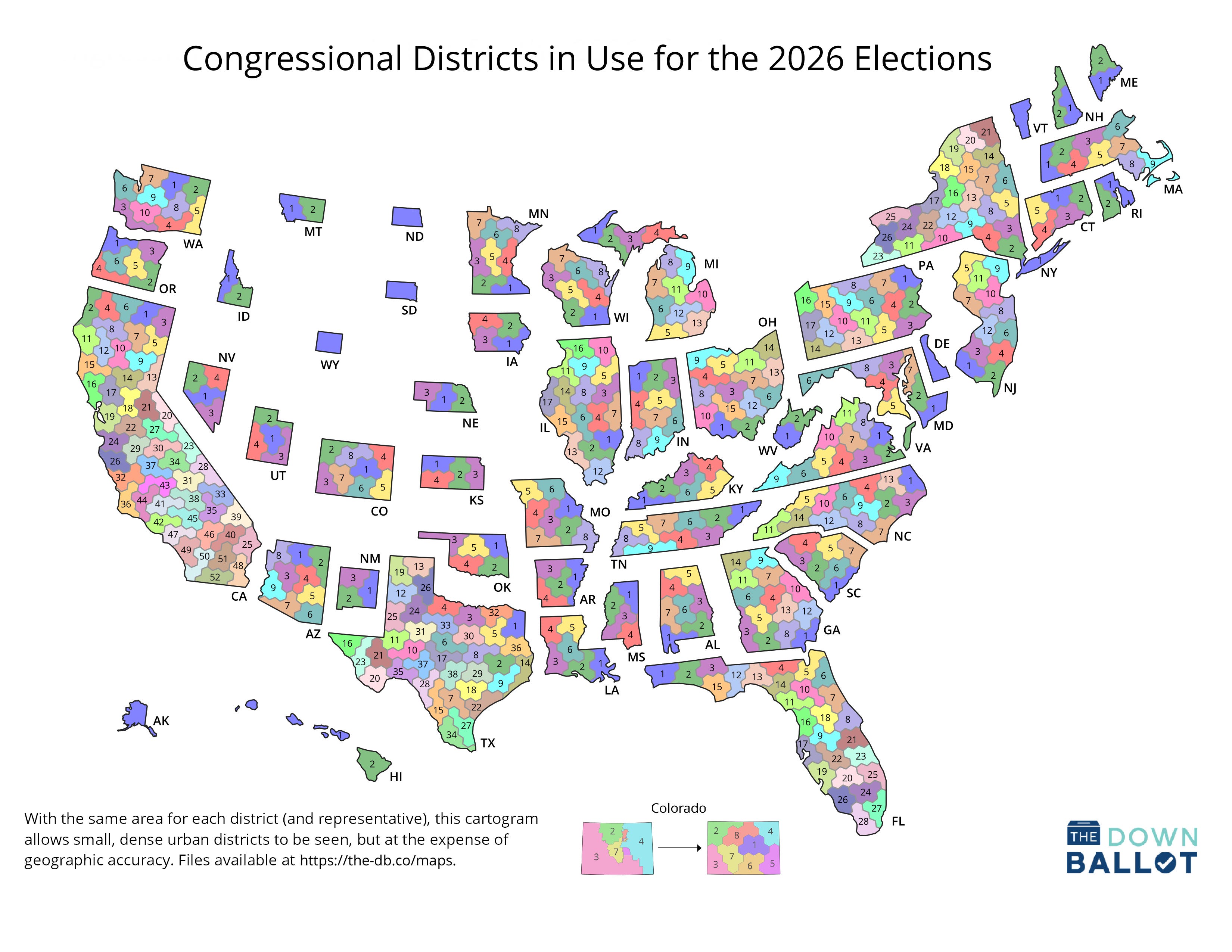
The Downballot is pleased to present the latest update to our “hexmap” of congressional districts that shows every district as the same size. This revised version reflects the new maps adopted by 10 states since the 2024 elections.
We first introduced this map, which was created by Daniel Donner, more than a decade ago to address a vexing problem. Even though every member of Congress gets just one vote, traditional maps of congressional districts over-emphasize sprawling rural districts while rendering small urban districts almost invisible.
This makes maps showing the distribution of political power in the House misleading, as seas of sparsely inhabited red obscure densely populated corridors of blue.
Even Donald Trump tried to take advantage of this in 2019 by sharing an overwhelmingly red map of counties (which share the same problem as congressional districts) painted according to their results in the previous presidential election with the caption, “Try to impeach this.”
We love creating maps like these and sharing them with our readers, but as you might imagine, it’s challenging, time-consuming work. If you appreciate the effort we put in and our commitment to making resources like this one paywall-free, we hope you’ll consider supporting The Downballot by upgrading to a paid subscription.
That map and others like it frequently prompt a response that “land doesn’t vote.” The Downballot’s hexmap—a cartogram whose basic units are hexagons—is our take on that response.
Under our approach, every state retains its familiar shape. The gaps between them, meanwhile, reflect the nation’s population density, or lack thereof. The large empty spaces out west, in particular, show how thinly the region is populated relative to much of the east.
Most importantly, because every district is made up of five hexagons (with some slight adjustments to account for state borders), all of them are distinct and clearly visible. Whether you’re using this to illustrate the outcome of congressional roll calls, the predominant type of land cover in every district, or the results of an election, no district dominates or disappears.
Below is a favorite of ours, showing how the 2024 presidential election played out in every congressional district that will be used in this year’s midterms. (We recently released updated calculations for this data set as well to account for the frenzied new round of redistricting that unfolded over the past year.)
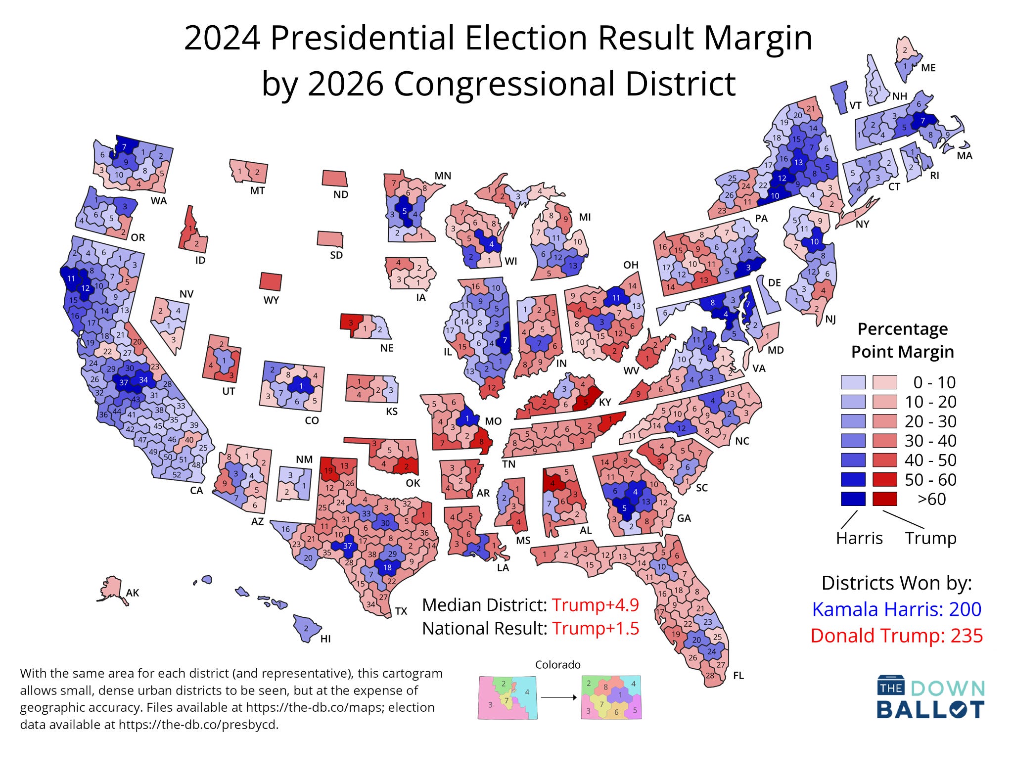
There are, of course, tradeoffs. The biggest is that districts sometimes cannot be placed within states where you’d expect them to be geographically. For instance, the districts that make up New York City all appear to be in upstate New York in our map. There simply isn’t enough room for them downstate.
Colorado offers a helpful illustration. On the left is a traditional map, while on the right is our hexmap. No district winds up precisely where it can be found in real life, but many, such as the rural 3rd and 4th, remain at their respective ends of the state. Others, like the 6th, shift position more dramatically, in this case from the Denver suburbs southward to the San Luis Valley.
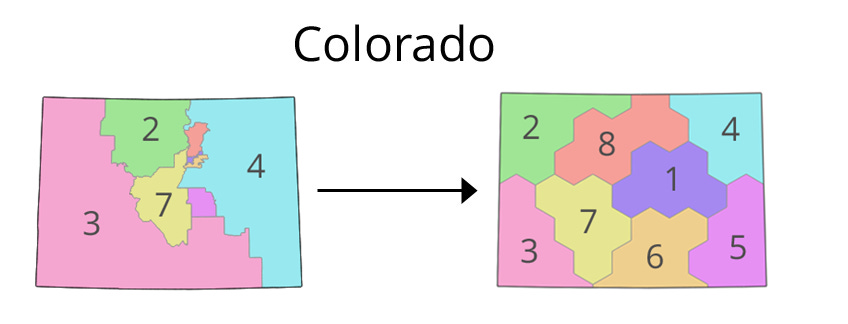
There’s simply no getting around this. It’s impossible to create a map that simultaneously preserves geographic fidelity, accurately reflects political power, and maintains states in a recognizable shape.
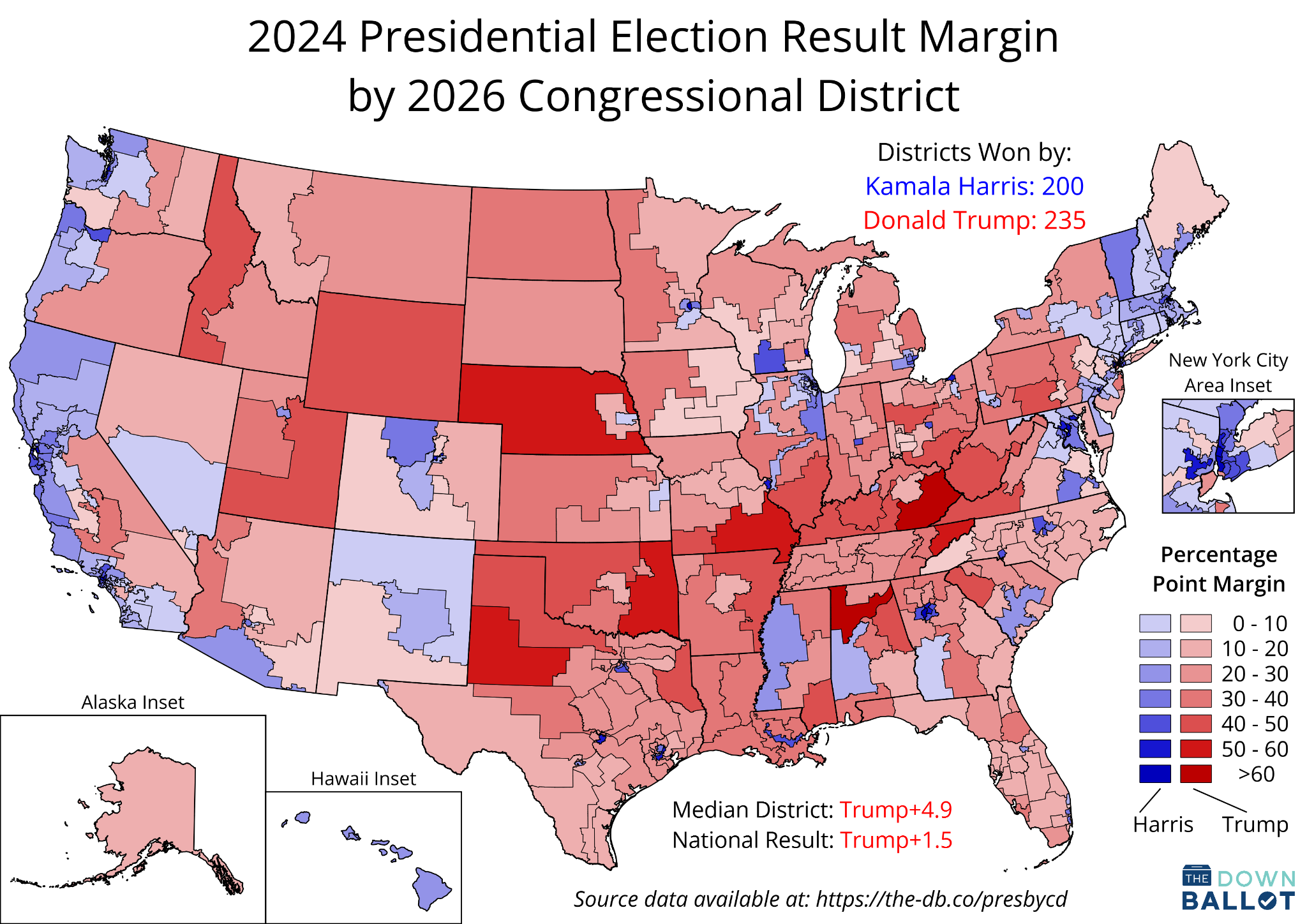
Therefore, our preferred approach when we use our hexmap is simply to release a traditional map alongside it. Below you’ll find just such a map of the 2024 presidential election results by congressional district—the companion of the hexmap above.
Geography does still matter with our hexmap, though, which is why we update it whenever a state adopts a new map. Tennessee, where Republicans just passed an aggressive new gerrymander, presents a stark example. In the pair of images below, our rendering of the state’s old map is on top, while our new one is just beneath it.
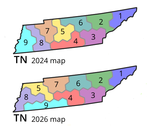
The GOP’s chief target was the majority-Black 9th District, which had long been a compact constituency based in Memphis. To erase the voting strength of Black voters, Republicans instead drew a snake-like district from downtown Memphis all the way to the Nashville suburbs some 200 miles away, pulling in heavily white, rural turf along the state’s southern border.
The end result is the light blue rod you see just above. It’s the first time we’ve ever represented a district as five hexagons all in a row like this, but it reflects the extreme nature of the Tennessee GOP’s efforts to subjugate Black voters.
We’ve made extensive use of our hexmap over the years, and the good news is, you can, too. We make our map freely available under a Creative Commons license, meaning you can use and adapt it for any purpose you like as long as you attribute the map to The Downballot.
Some folks who’ve used our map include the Washington Post, FairVote, and a team of political scientists led by Yale Prof. Shiro Kuriwaki.
At this link, you’ll find a variety of versions, including static images, vector graphics, and shapefiles. You can also find files for the traditional map on the “Overview” tab. If you do use either map, please let us know. We love to see people putting them to good use!
These maps are excellent and should be shared with Independents and Democrats, from disheartened to engaged. Your insights are longstanding and impressive, and I will soon become a paid Substack subscriber to The Downballot.